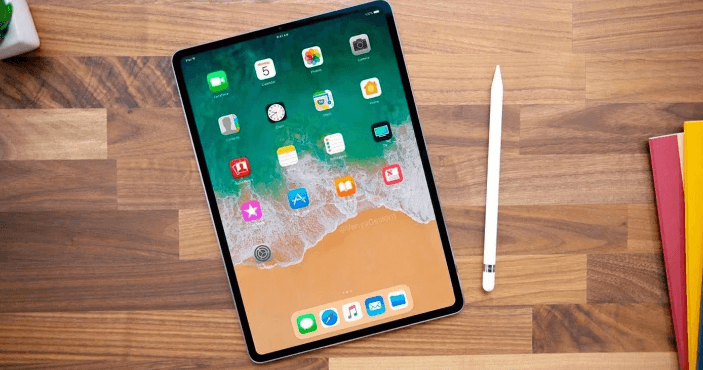
Responsive design has been around now for how many years, and has been one of the hottest topics in the World Wide Web at present. The term responsive design describes a website that responds to the different devices, as well as screen sizes.
Websites which are developed in such way utilize different specific style techniques, client-side scripting method, and multiple style sheets in order to ensure that all elements appear, disappear, resize, and shift depending on the size of the screen.

Responsive design as a powerful development technique allows a website to properly display without the need for the various versions of the website. As a result, the website would look great on a tablet, laptop, smart phone, and desktop. The way how the users interact and read the contents on their mobile phone, tablets and other devices with smaller display becomes completely different from a standard desktop. In addition, we can now see many companies that have responded with the mobile versions of their websites and other applications which are basically the duplicate of their website only that it is in an easier format.
By having a responsive design, there is one website that has multiple, if not limited display of possibilities based on screen resolution of the user. The buttons change size, blocks of content shifts; menus have evolved into dropdowns, and so many more things to provide an optimum user experience regardless of the device being used.
A responsive design does not only look awesome and it makes a website appear like you have pulled out all the stops and thought deeply of everything. In addition, it is quite practical as it can represent a maximum navigation and viewing experience to every visitor while using different devices with different screen sizes. If your iPhone has a very small menu, there would be no more worries with a responsive design. With this design, the menu will be changed into a drop down or to a slide-out large-print kind of menu. And if your call to action is too small, a responsive design will stack the buttons and display them at a larger size.
A responsive design has trended since the year 2012 and at present, it continues to be one of the most sought-after technique and method. If you want to have a new website, consider having it developed in a responsive design. A website can do a lot in every aspect of a business, thus, it needs to be something that is always on the go. People at present know which one is responsive and which is not. They know where they can benefit from and which one is a mere facade. By offering people what they need and one that can provide them convenience would guarantee better results.
A responsive design can help a business achieve its goal and bring more benefit to the website. A lot of users at present like visiting different websites using their tablets and mobile devices which makes having a responsive design a good option. The trend now is to be accessible in the different devices, and this can only be made possible when one has a responsive web design.
Image Credit – spyderweb.co
